Waves Project
Project Report
Saige M. Rasmussen and Brandon N. Biddle
Perceived Pigments
Abstract -
The project we created is called, Perceived Pigments. We tested with a survey how people perceived colors and the emotions tied to those colors. We got less than wanted results but we dealt with this and still finished the project with a strong will. As artists both me and my partner loved doing all sorts of things not only with pencils but also colors and so we seemed intrigued to find our own way of testing Pigments. Our question to drive us for the results are as followed: Do high schoolers connect colors to emotions differently than the socialized beliefs? We of course sent a survey with 10 questions that ask the basic questions like, what color makes you feel etc. Now, this gave us 6 results listed later in this report. We will describe why only 6 later in the report as well.
Introduction -
We chose this topic, pigment color, because sound waves and light waves didn’t interest us as much as pigments. Pigments are what artist’s use for color and that is why Saige is interested in the way it works. Brandon is interested to show others in how dressing and maybe designing things can really affect how they are perceived or approached. We thought this was an interesting idea to dive into. From that basic standpoint we delved into the humanitarian point of view. Me and Brandon are not the most sciency people out there so adding in this more psychological point, it made us more interested in this subject of pigment color.
Question and Hypothesis:
Do high school kids connect colors to emotions differently than the socialized beliefs? (Red=anger, happiness=yellow etc.)
Methods & Materials:
To start off this project was the a research background, we talked with each other and had set ideas. Then we used a few different websites to see others opinions. This method helped the most in finding set ideals. We then started to get familiar with our surroundings in this project and found making a survey was a professional and simple way to complete our project.
Results:
Our results were not as few as we wanted for most people had other things to do. Anyways we survived with our results and are still satisfied with the results for some of them prove our hypothesis. The results are as followed:
Love: Red, Red, Red or Pink, White, Light Blue, Maroon.
Sadness: Blue, Blue, Purple, Dark Navy Blue, Dark Green, Misty Blue.
Happiness: Yellow, Yellow, Sky Blue, Yellow/Green, Light Teal, Yellowish Orange.
Anger: Red, Red, Mahogany, Red, Yellowish Green, Blood Red.
Excited: Light Cyan Green, Royal Blue, Orange, Purple, Magenta, Shimmering Gold.
Anxiety: Light Cyan Blue/Purple, Lime Green, Purple, Blue, Dark Green, Hot Pink.
Calm: White, White, Blue, Blue, Gray, Midnight Blue.
Nervous: Light Cyan Pink, Grey, Human Skin hue/color, Blue, Dark/Light shades of Yellow, Green, Orange, Lime Green.
Hate: Black, Black, Black, Bright Orange, Black, Dark Green.
Disgust: Puke Green, Brown, Puke Green, Lime Green/Yellow, Brown Green(Puke).
Sadly without the access to a computer we can't convert this data to charts and graphs. This has taught us we should be more prepared and we figured the error was something that could easily be fixed in the next time of work. But though some of the answers are sort of scrambled, we believe that it shows a type of hue for each emotion.
Discussion
Now, we really had only a week to complete this project, and we had trouble collecting enough results from people. We obviously couldn’t force them to take the survey. This was a very simple survey experiment, nothing too elaborate with the time limit we had. The results are answers to the simple questions we had for the survey(What color makes you feel etc.) We expected the results to conclude that most people are socialized to associate certain colors with certain emotions. As you can see in the results, love had more red or pink, sadness were mostly blue colors, and happiness was mostly yellow etc. Some of them were much more scattered, such as excitement, all colors were very different. This doesn’t necessarily conclude anything, but most of these emotions are associated with colors. There are some outliers which made some of the results confusing and inconclusive.
This experiment could have had much more in depth results and research. We only had a week to do this, of course our experiment isn’t going to win rewards. We kept it simple and I believe we did well with the time limit we had. If we had more time we could’ve gathered much more results from more people and had more in depth questions. Going into socialization and people’s reasoning behind why they chose their answer. We also had a bit of a hold up in our experiment because people just weren’t taking our survey. We reached out in person and got some results but not enough to write a report on. We then paused and didn’t know what to do, then after talking to our teacher Brian. We decided to just send out more, we did get a lot of results after that. Overall, I believe we did well with the time limit we had. We tried to be as punctual as possible.
Bibliography
Rube Goldberg
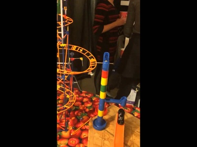
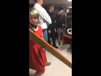
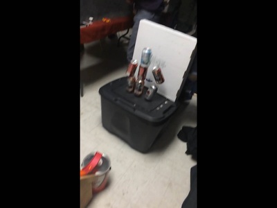

Now, in this project with my two other group members, Aidyn and Memo we created this Rube Goldberg. We originally wanted to make toast but as we went through the project things change. We started out very confused, disorganized, and frustrated. Over time we pulled ourselves together and were able to create this Rube Goldberg. Now the first step was a roller coaster car hitting a screw then it would let loose marbles which would then hit a car. The car would hit a weighted cup, causing a chain reaction of other cups to fall, also another weighted cup beside it would fall and pull the trigger of our nerf gun through the pulley, the bullet would then hit some cans. Now up top the other cups that fell hit dominoes which then hit a marble, which would bump another car. This car would speed down a ramp and crash into some cans. We had too endings and our Rube took up the most space, in all honesty it was a very mashed together Rube Goldberg.
Practice Project
Project Report
Title
Our group is testing how technology affects social interaction in groups.
Abstract(needs results to complete)
Introduction -
We are doing this because we have to. The question was relevant to our own lives and we were just being curious. There are many studies/articles online that show how negative technology is on the people, examples: http://stewardshipreport.com/viewpoint-when-is-too-much-the-negative-effects-of-technology/ and http://www.huffingtonpost.com/cris-rowan/technology-children-negative-impact_b_3343245.html (change to link form) We want to test this for ourselves and make our own judgements.
Question and Hypothesis:
“Do computers impact physical communication in groups?”
If iphones and computers affect this group of people negatively, such as sleep deprivation then shouldn't we stop using technology because it's hurting them? I don't know ok.
Methods & Materials-
Our question is, “Do computers impact physical communication in groups?” We want to answer this question because many scientists and citizens think that technology is predominantly bad for human health and our social well being, but we wanna test that for ourselves so we can make our own judgements on this subject. We will send out a survey to the whole class of 2019, see how they are affected by technology, such as phones and computers. Then create a data table and graph for a statistic. Then create an infographic to display our results.
Results(still collecting) this section you should display and summarize all of the relevant
numerical (quantitative) and descriptive (qualitative) data and observations
from your experiment. The data can be displayed in tables, figures (charts
and graphs), images or in text. In this section you should summarize trends
in the data, and also explain any issues with obtaining your results and suggest
potential sources of error.
Discussion(not finished because we are a bit behind, working on it outside of class)
The overall purpose of the discussion is to explain what the results from
the experiment are, describe how confident you are in the results and discuss the significance of the results in regards to your hypothesis. (Here are some suggestions of what to include, not all of these ideas will apply to every situation)
Restate why the experiment was done and what the expected results were.
Summarize the significant data collected during the experiment.
State the experimental results and use the data summarized in in
the previous section to logically confirm or disprove what you
initially expected. Where applicable offer a logical explanation as to
why the independent variable had or did not have a measurable
effect on the dependent variable. If the lab involved measuring a
known quantity, compare your experimental value to the known
value using a percent error calculation.
Discuss the significance of your results. How important are the
results of this experiment? Discuss how confident you are in your results by discussing the
variability in your data and the potential sources of uncertainty and
error in your experimental design.
Discuss improvements to the experiment that are relevant to the
sources or error and uncertainty you identified. Lastly, discuss
possible further experimentation that is related this investigation. If
you have a new hypothesis after analyzing your results state it and
state how you might test it.
Bibliography
Include any relevant sources that you referenced in the summary
Reflection-
This project was a little tough for me, I have a hard time working with Physics and Science in general.
I did learn in new tricks in spreadsheets and how to create an infographic. We did not finish our report and we have learned from that and work harder and now know that we should not work together as a group.
